Mobile Marketing 101: How to Optimize Your Site, Ads, and UX for a Seamless Mobile Experience


The statistics don’t lie, and they’re more startling than you’d imagine. More than 62% of internet traffic worldwide is via mobile—that’s almost three-quarters of all clicks, scrolls, and purchases on devices smaller than a paperback book. What makes this statistic truly mind-blowing is that mobile commerce isn’t just influencing the economy; it’s rewriting it.
We’re seeing m-commerce capture over 10% of all retail sales globally, turning pocket-sized touchscreens into the planet’s most potent shopping malls. Now this isn’t your run-of-the-mill “mobile is important” sermon. This is the tale of consumer behavior gone fundamental, establishing a new set of rules for engagement that many businesses are still struggling to figure out.
The brands winning aren’t just mobile-friendly—they’re mobile-first, mobile-obsessed, and mobile-strategic in ways that would have seemed impossible just a few years ago. Here’s the brutal truth: anything but a mobile-optimized business is not just a lost opportunity. It IS missing in action for a huge segment of its potential customers.
This guide will talk you through all you need to know about crafting a seamless mobile experience that turns browsers into buyers.
1. Optimizing Your Website for Mobile: Key Elements
Responsive Design
Whether someone’s checking out your site on a jumbo-sized desktop monitor or tiny smartphone screen, your content should flow beautifully. What’s special about responsive design? Google’s mobile-first indexing means that search engines now primarily use the mobile version of your site for ranking.
If your site isn’t mobile, you’re indicating to Google (and your would-be customers) that you don’t care about UX design best practices.
- Test your site obsessively on different devices and screen sizes.
- Keep your layouts clean and intuitive with large, tappable buttons (minimum 44×44 pixels).
- Use scalable images and fluid grids that stretch and shrink gracefully.
At GeistM, our creative team specializes in crafting responsive designs that don’t just function, they dazzle. Functionality without beauty is like a car without paint. It still works, but no one will be blown away.

Mobile Site Speed
Here’s a sobering truth: users want pages to load faster than you can say “loading”. A mere 1-3 second wait makes bounce rates soar over 30%! That’s equivalent to having shoppers enter your store and bolt back out because the door was slow to open. Speed tuning isn’t purely technical; it’s psychological. When somebody taps on your site, they are making a micro-commitment. Each second they delay is a second they’re debating that commitment. To prevent this:
- Compress images mercilessly, utilizing next-gen formats such as WebP.
- Slash pop-ups and annoying ads that break the experience.
- Use lazy load images and assets.
Mobile-Friendly Navigation
Navigation on mobile is as if you’re a tour guide in a foreign land. Mobile users want it now; they want it quick and easy, without having to search through convoluted menus.
Mobile navigation best practices:
- Own those hamburger menus or sticky headers for a slick, accessible design.
- Remember to place your key content and calls-to-action above the fold.
- Space out navigation elements enough to avoid accidental taps.
2. Creating Effective Mobile Ads
Mobile Ad Design
The small screen real estate means every pixel, every word, and every design decision can make or break your campaign.
Mobile marketing best practices taken from successful campaigns all have these characteristics in common:
- Striking, scroll-stopping imagery.
- Minimal words, maximum impact.
- Easy-to-see, practical CTAs that tell users exactly what to do.
- Vertical optimization for Instagram Stories and TikTok.
Our direct response Content & Creative team knows how to craft mobile-first ads that not only look beautiful but also turn browsers into buyers. We recognize that mobile advertising is as much about psychology as it is about design. And our content is drafted to be optimised for mobile reading.
Platform-Specific Ads
Here’s where many companies go wrong – they create one ad and attempt to use it everywhere. That’s like a tuxedo at the beach; technically, the ‘right’ clothing, but totally the wrong expression.
Each platform has its own personality, audience behavior, and optimal format. Mobile content marketing needs this nuance of platform dynamics.
Instagram Stories require portrait, eye-catching content that’s native to the platform. Facebook feeds look better with a square or horizontal layout. TikTok needs genuine, fun content that doesn’t feel like traditional advertising.
We custom-create and test creatives & content for every major mobile platform, because we understand that context is king when it comes to executing a digital marketing plan.
Location-Based Targeting
Location is mobile marketing’s secret weapon. Your customers have GPS in their pockets wherever they go, which opens up entirely new opportunities for contextual marketing. It’s not just being aware of where people are–it’s understanding how that place correlates to their mindset and buying intent.
Strategic location-based habits:
- Geotargeting for real-time promos and local offers.
- Configure geofenced ads that trigger when users access specific locations.
- Think about the location and users’ psychology.
3. Mobile UX: Designing for a Seamless Experience
Simplified Content Layouts
Mobile users scan, they don’t read. They want to consume information quickly, painlessly, and with no friction. Long blocks of text on mobile devices are like offering a five-course meal on a paper plate — feasible, but not ideal.
The psychology of mobile consumption is fundamentally different from desktop behavior. Mobile users are typically multitasking, on the go, or have very short attention spans. Your content must honor these truths.
Content optimization techniques to implement:
- Use short paragraphs and sentences that are easy to digest.
- Break up content with bullet points, subheadings, and visuals.
- Utilize big, readable fonts (16px minimum) — no one likes to squint at their phone.
Our editorial team develops handset-optimized copy that incorporates photos and attention-grabbing visuals to deliver a fluid, pleasurable reading experience. We get that mobile content marketing is about respecting users’ time and attention.
Tap-Friendly Design
Mobile interaction is a distinctly different experience from desktop interaction. Users tap, swipe, and pinch instead of click and hover. That is, your design has to consider finger-driven navigation and touch interaction physics.
Design guidelines for touch:
- Make buttons and links big enough and well spaced.
- Show visual feedback for touches.
- Think thumb-centric designs that keep key actions within easy reach.
Optimizing Forms for Mobile
Mobile forms are where good user intentions come to die. Deep, complicated forms on mobile are like asking someone to complete tax forms while on a roller coaster. It is technically feasible, but not something anyone desires.
Form opt-in strategies:
- Keep forms short with only essential fields.
- Turn on auto-fill and input type tuning.
- Break complicated forms into logical steps or pages.

4. Copywriting for Mobile Content
Writing for Scannability
We’ve already established that mobile visitors are scanners, not readers. They want targeted information, rapid answers, or instant gratification. Your content must be designed for this activity, with explicit hierarchy, conspicuous entry points, and bite-sized pieces of information.
Content layout guidelines:
- Organize with descriptive headings and subheadings.
- Make sentences concise and straightforward with no excessive jargon.
- Employ bold text sparingly to emphasize essential points.
Our content team crafts concise, mobile-friendly copy that seamlessly integrates visuals and graphics to enhance engagement and comprehension.
Mobile-Friendly Headlines
Mobile headlines are like store windows—they have to catch someone’s attention at once and sell the value. You have seconds to persuade someone that you’re worth their time and attention.
Headline optimization tips:
- Write attention-grabbing headlines but keep them short (6–10 words).
- Use mobile and user-intent-related keywords.
- Create emotional hooks that resonate with your target audience.
CTA Optimization for Mobile
CTAs on mobile are the closing stretch of a well-planned dance — everything leads to this point. Your CTA must be clear, compelling, and straightforward to follow.
CTA cheat sheet:
- Make CTAs simple and proactive (“Shop Now”, “Get Started”, “Subscribe”).
- Keep your CTA buttons visible and tappable.
- Utilize color and placement contrast.
5. Best Practices for Mobile Content Formatting
Images and Videos
Visuals on mobile devices must be fast, beautiful, and serve a purpose. Every photo and video needs to load fast, look perfect, and contribute to your message.
Visual content optimization:
- Compress your images ruthlessly, but without compromising quality.
- Utilize mobile-friendly videos such as MP4.
- Keep videos short, ideally around 15–30 seconds, to maintain viewer engagement.
Font and Text Size
Typography (font and text size) on mobile is the house’s foundation — if it’s not strong, nothing else stands. Bad typography is unreadable, infuriating, and therefore useless.
Typography tips:
- Use readable fonts such as Arial or Helvetica, at a minimum of 16px.
- Set line height to 1.5 for comfortable reading.
- Ensure you have sufficient text and background contrast.

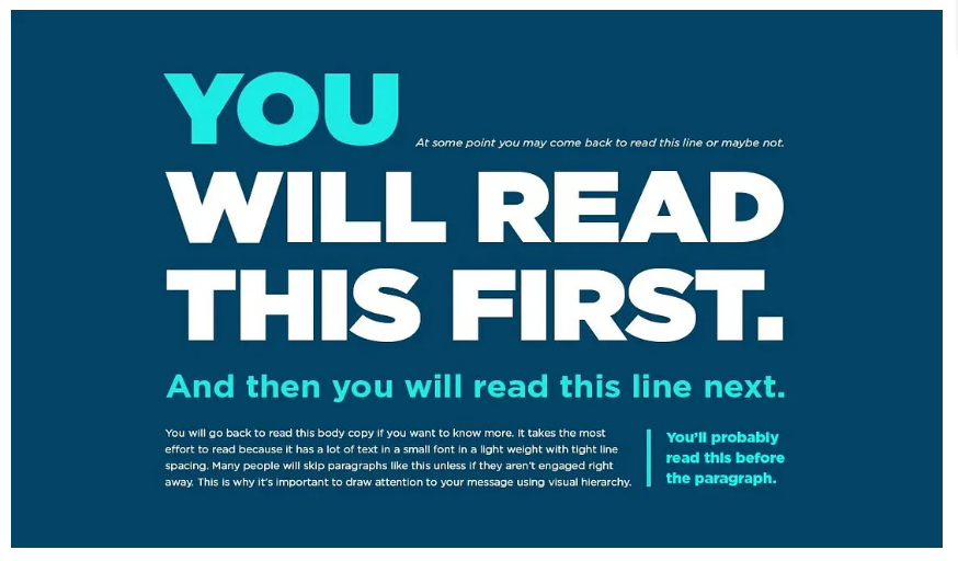
Layout
Whitespace on mobile is breathing room in a packed subway. Busy, cluttered layouts confuse users and render copy intractable.
Layout optimization techniques:
- Use ample white space to let content breathe.
- Break text and images into easy-to-process sections.
- Establish visual hierarchy with spacing, color, and typography.
Make Your Mobile Experience as Seamless as Possible
Mobile marketing isn’t just a mobile-friendly website — it’s all about the experiences you create that meet users where they are, how they are, and when they need you most.
Effective mobile marketing is part technology, part storytelling, part user psychology, and part data-driven efficiency optimization, strategic thinking, and execution perfection. The brands that will flourish are those that adopt a mobile-first approach in every aspect of their performance marketing strategy.

Why GeistM Is Your Mobile Marketing Partner
GeistM is not simply an agency; we’re your partner in mobile marketing transformation. Our expert creative, content, and strategy teams are mobile-first design, ad creative, and content optimization experts who move the needle.
We know mobile marketing isn’t simply smaller screens; it’s different mindsets, behaviors, and expectations. Our creative team combines innovative technology and data-driven insights to design campaigns that not only look visually appealing but also perform exceptionally well.
As marketers, we understand that to execute a successful mobile marketing campaign, you need to recognize both the technical constraints and the human psychology behind mobile behavior. We craft content that connects, design that converts, and strategy that gets business results.
Prepared to revolutionize your mobile marketing! Contact GeistM today and discover how we can enhance your content, ads, and user experience across every device. Your audience is expecting — let’s give them something incredible to discover.